Refreshing Cellcom’s ecommerce experience
We worked with Cellcom to identify and fix major checkout issues, refresh their brand, and design a modern ecommerce experience for their customers in Wisconsin.
User Research
UI Design

1. Project Overview
Cellcom is an enterprise-level wireless provider in Wisconsin. Their ecommerce site had become outdated and needed both design and usability improvements. They wanted to streamline the shopping and checkout experience while also aligning with a larger brand refresh effort.
Our role was to identify problem areas, redesign the shopping flow, and create a new visual system that would appeal to their target audience of younger customers. This project combined user research, usability testing, and close collaboration with their branding team.
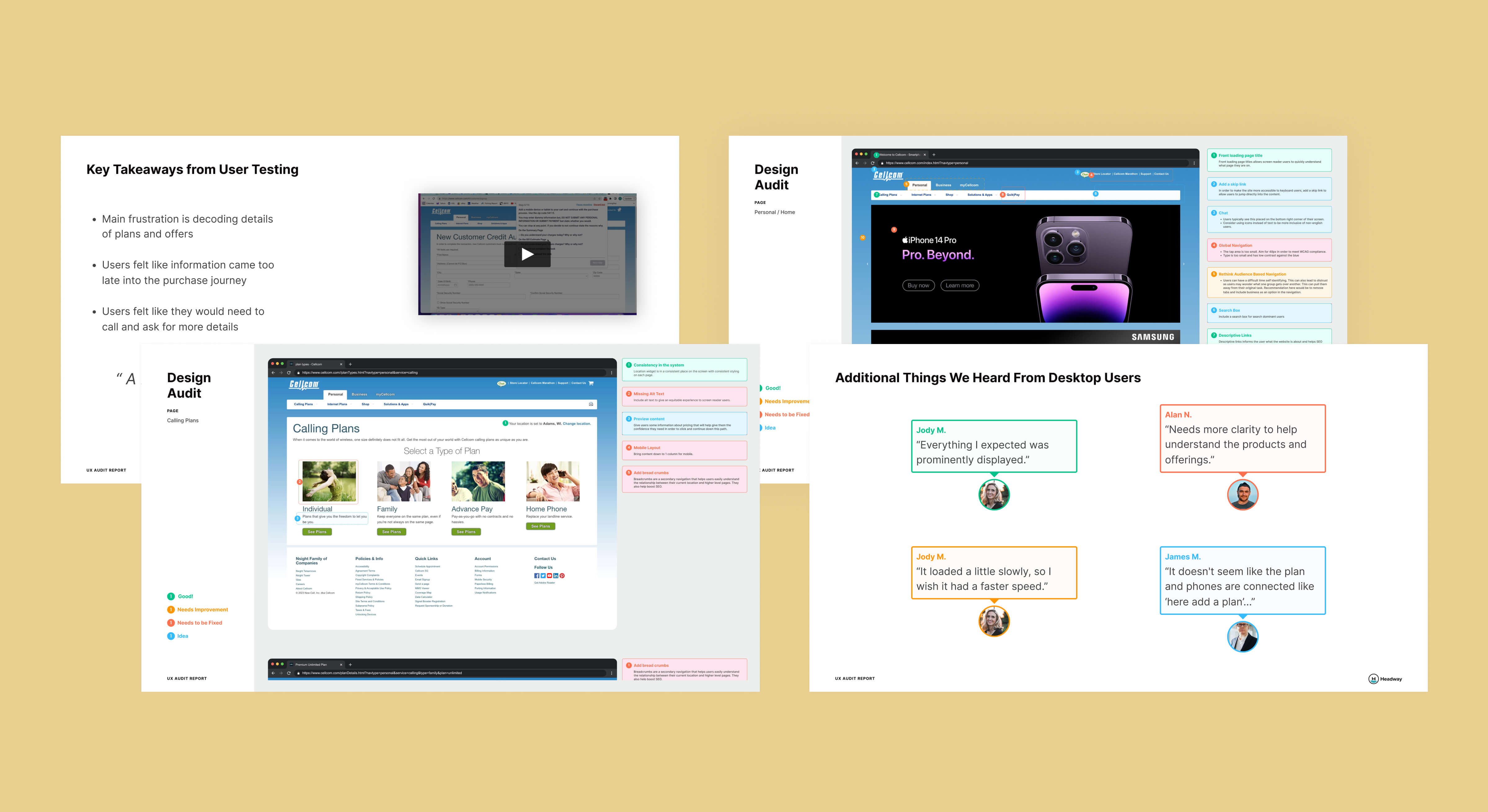
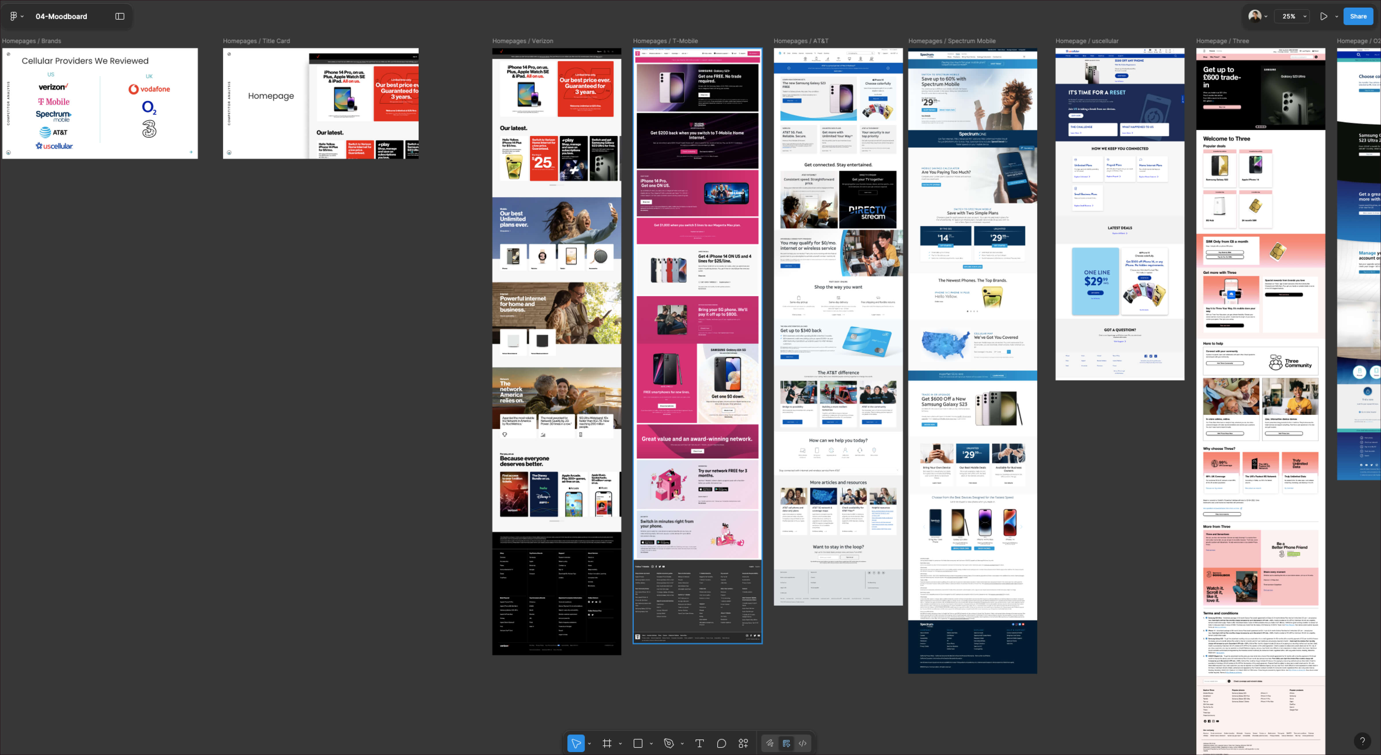
2. Research Study One: Ecommerce Checkout UX
We began with a UX audit and an unmoderated usability test focused on the ecommerce checkout flow. This revealed points of friction that were slowing customers down or creating confusion. The findings gave us a clear set of priorities for improving usability and flow. We compiled these into a report and presented it directly to Cellcom leadership, including the CEO.
3. Defining Success
The goal was to make the ecommerce experience intuitive and appealing while creating a visual identity that connected with younger customers. The design needed to align with the refreshed brand and address the usability issues uncovered in the research.
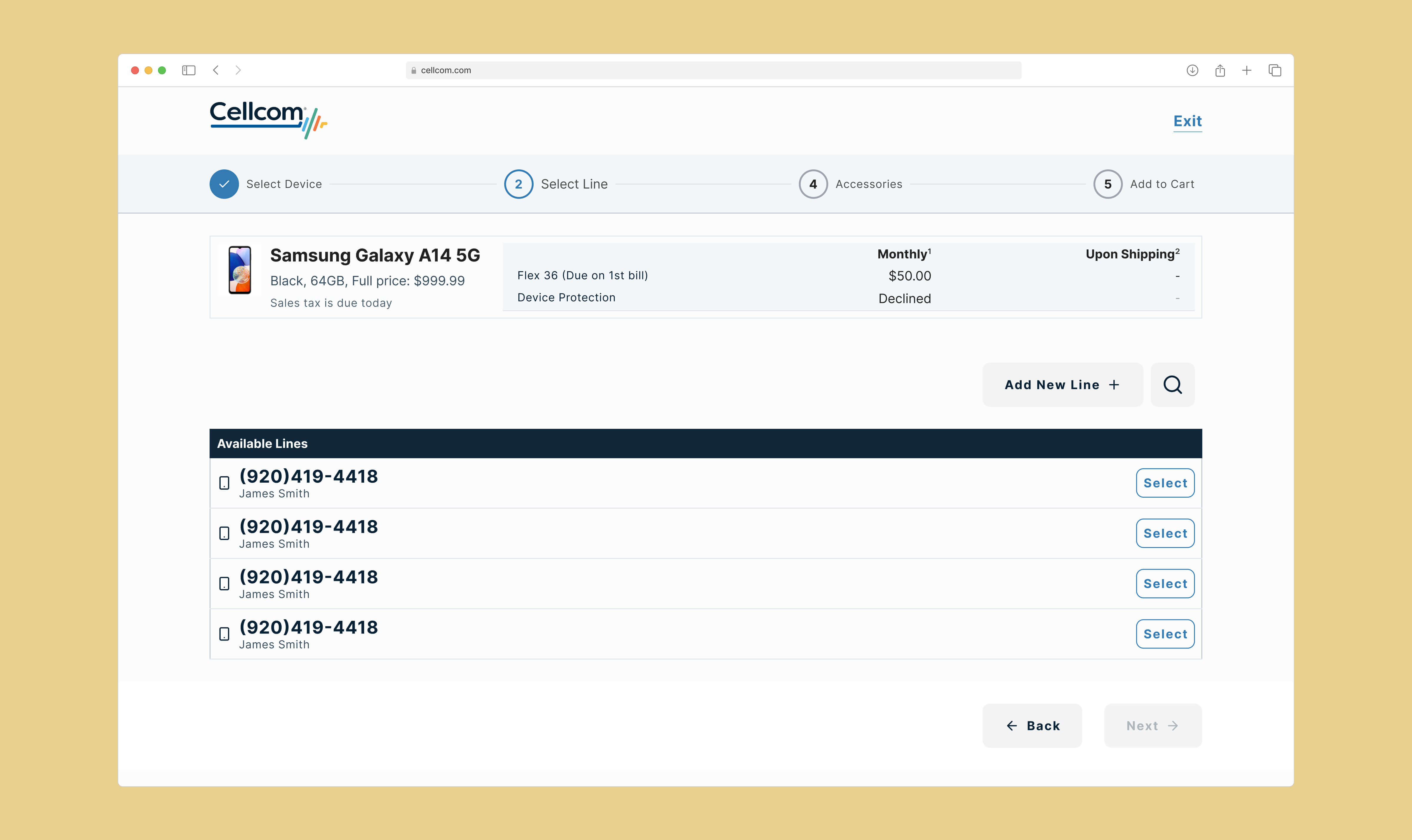
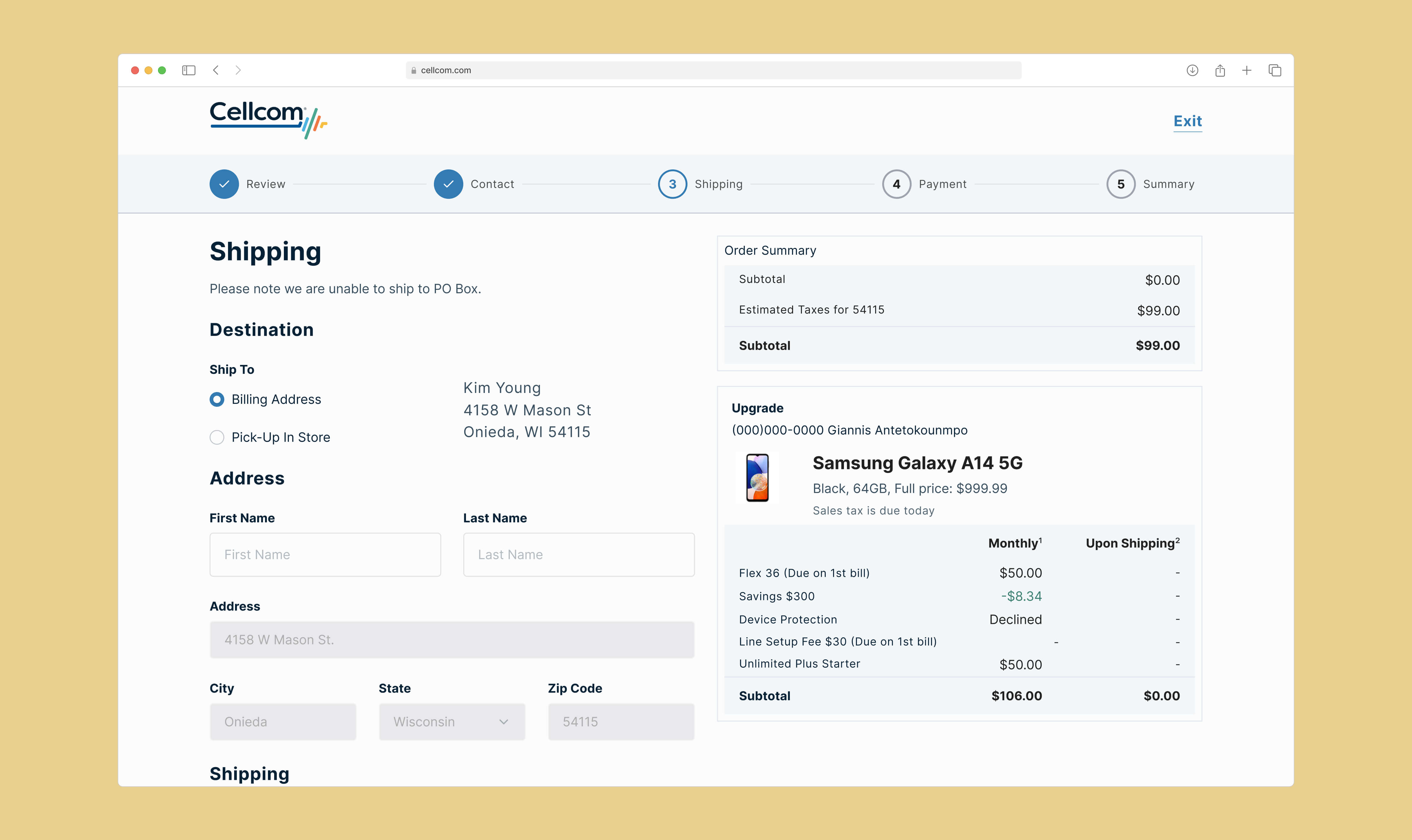
4. Design Process
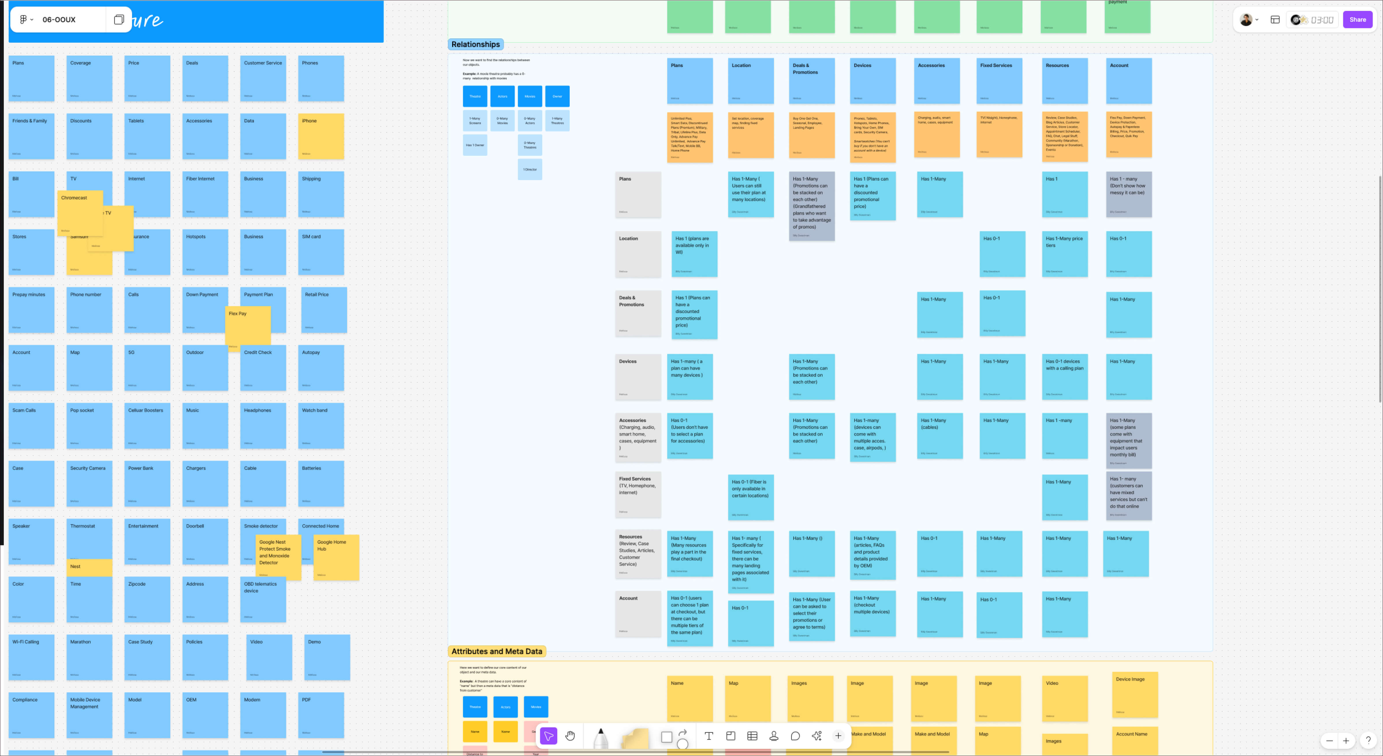
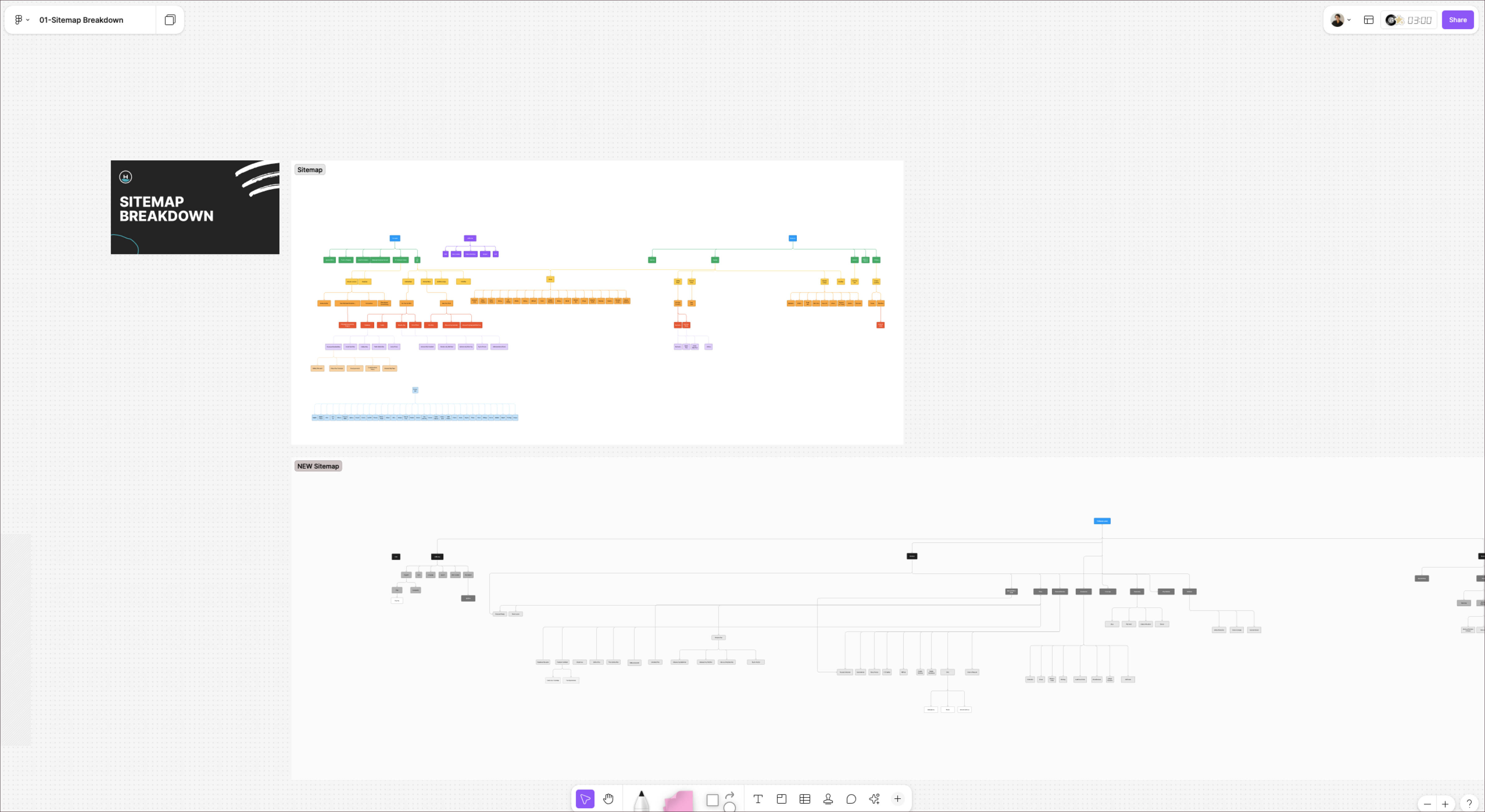
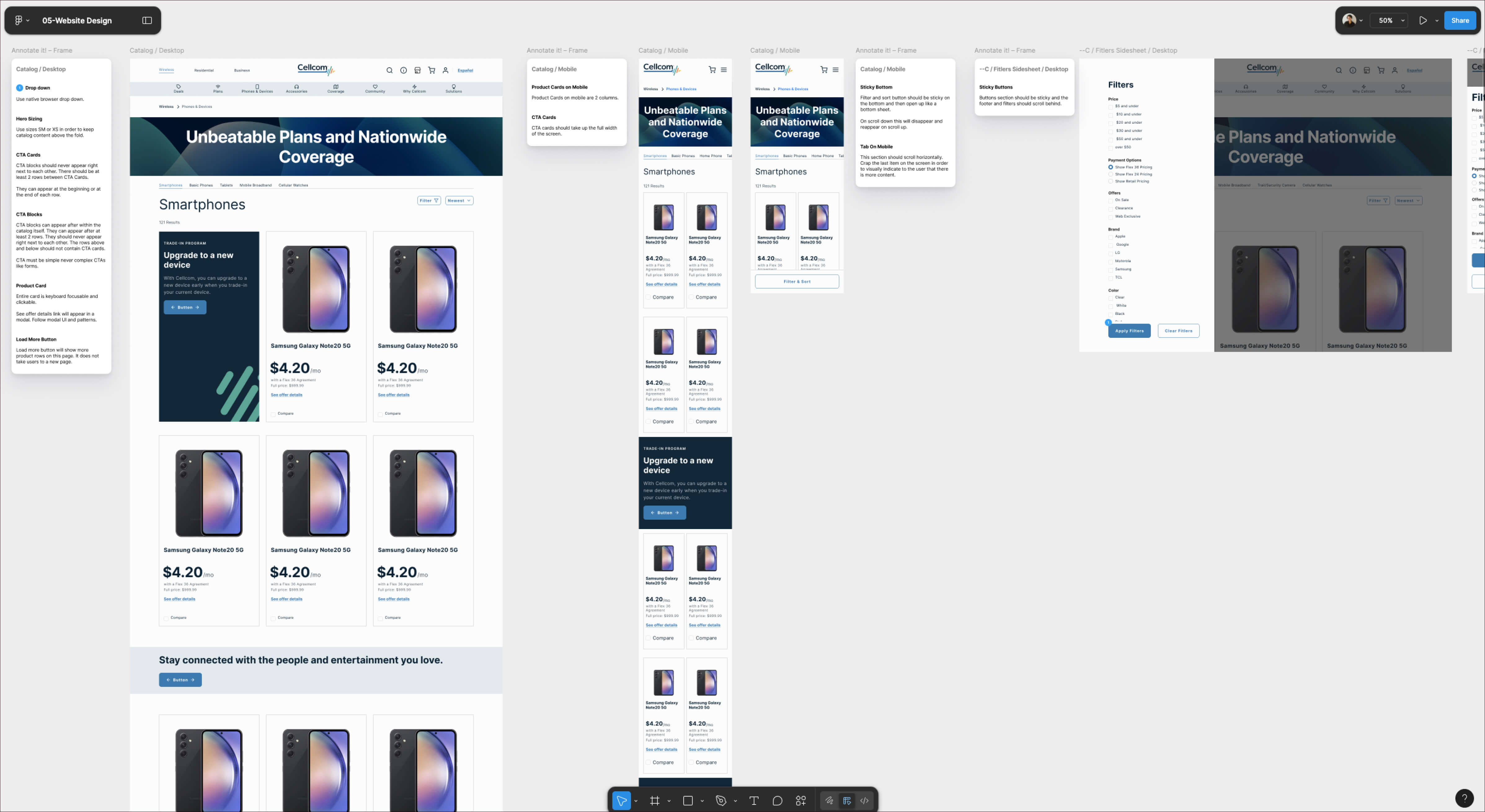
We began with an OOUX workshop to clarify how products, plans, and features were organized. This helped ensure the content structure made sense to customers and was easy to navigate. We then ran a sitemap workshop to validate and refine the overall information architecture. This evolved into a complete sitemap redesign, giving the new site a logical structure that supported shopping and browsing.
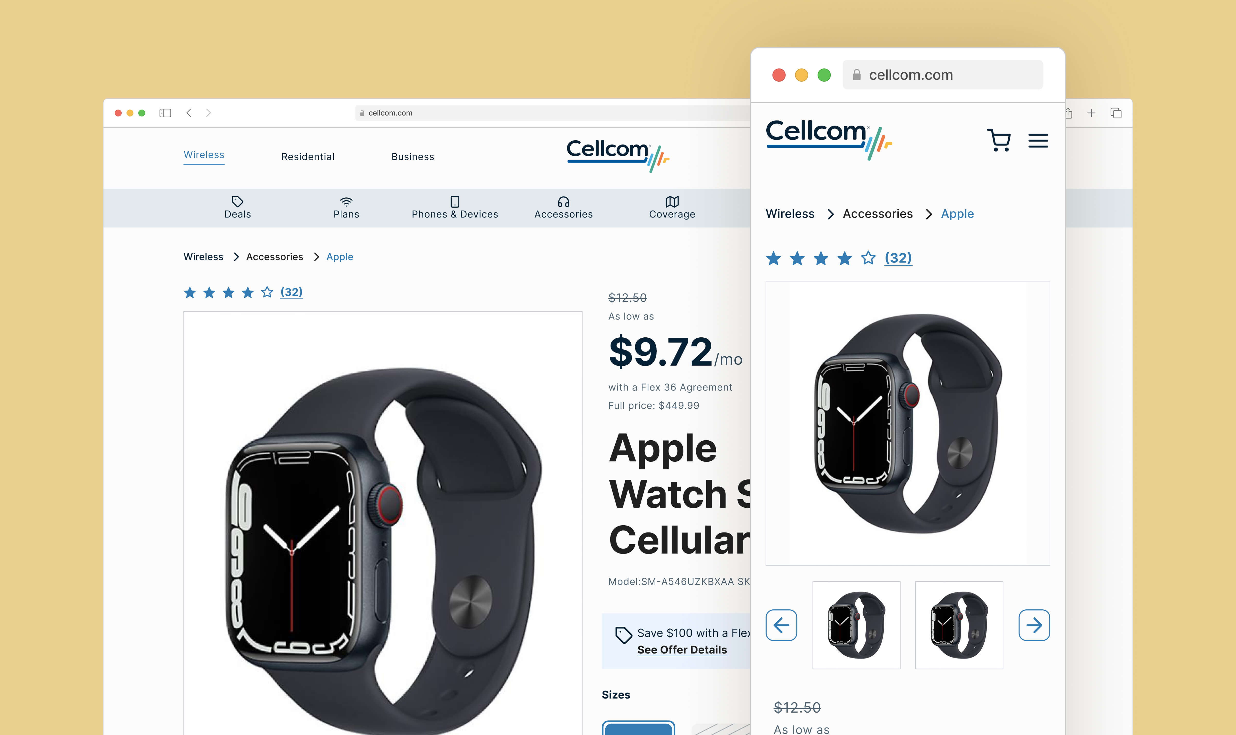
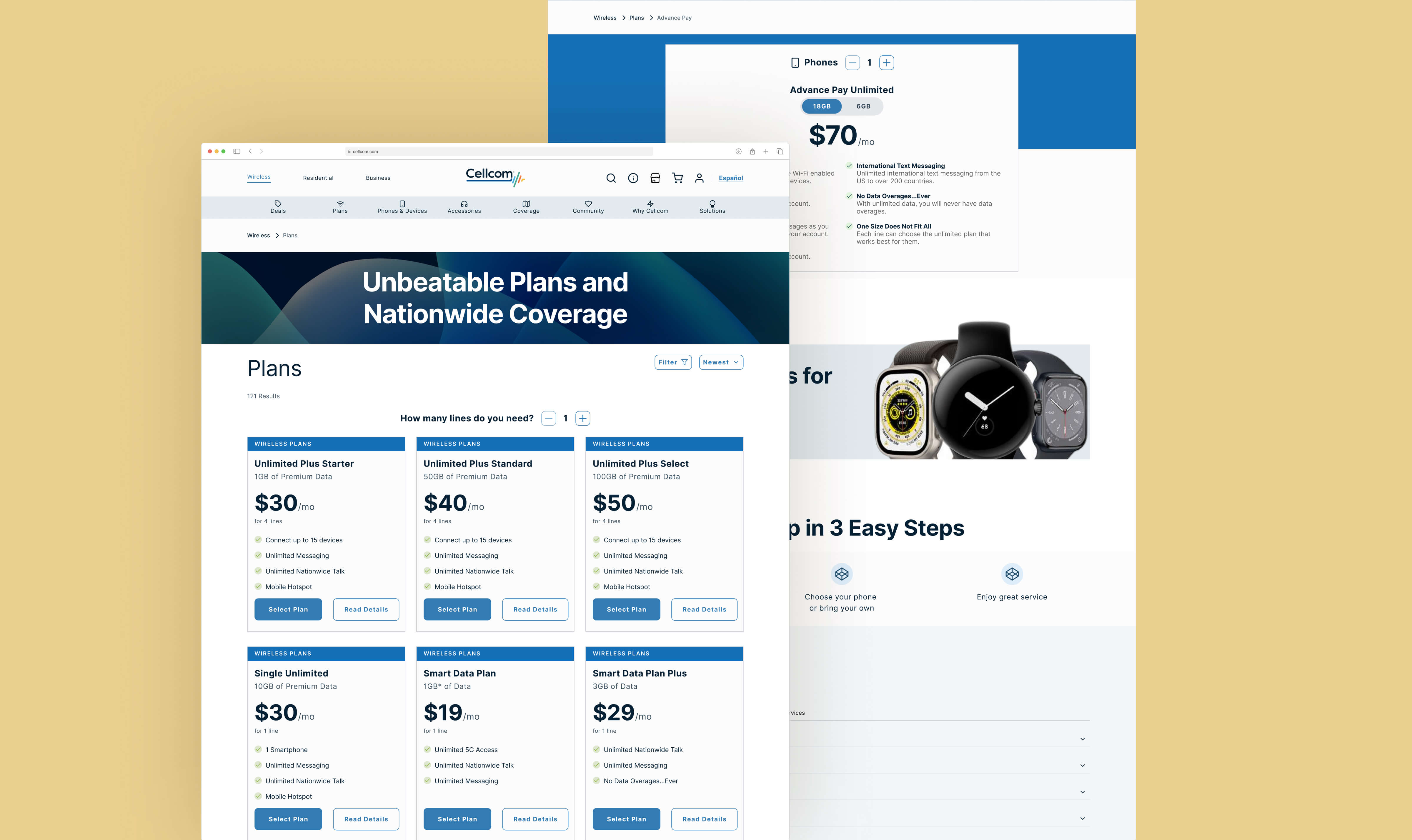
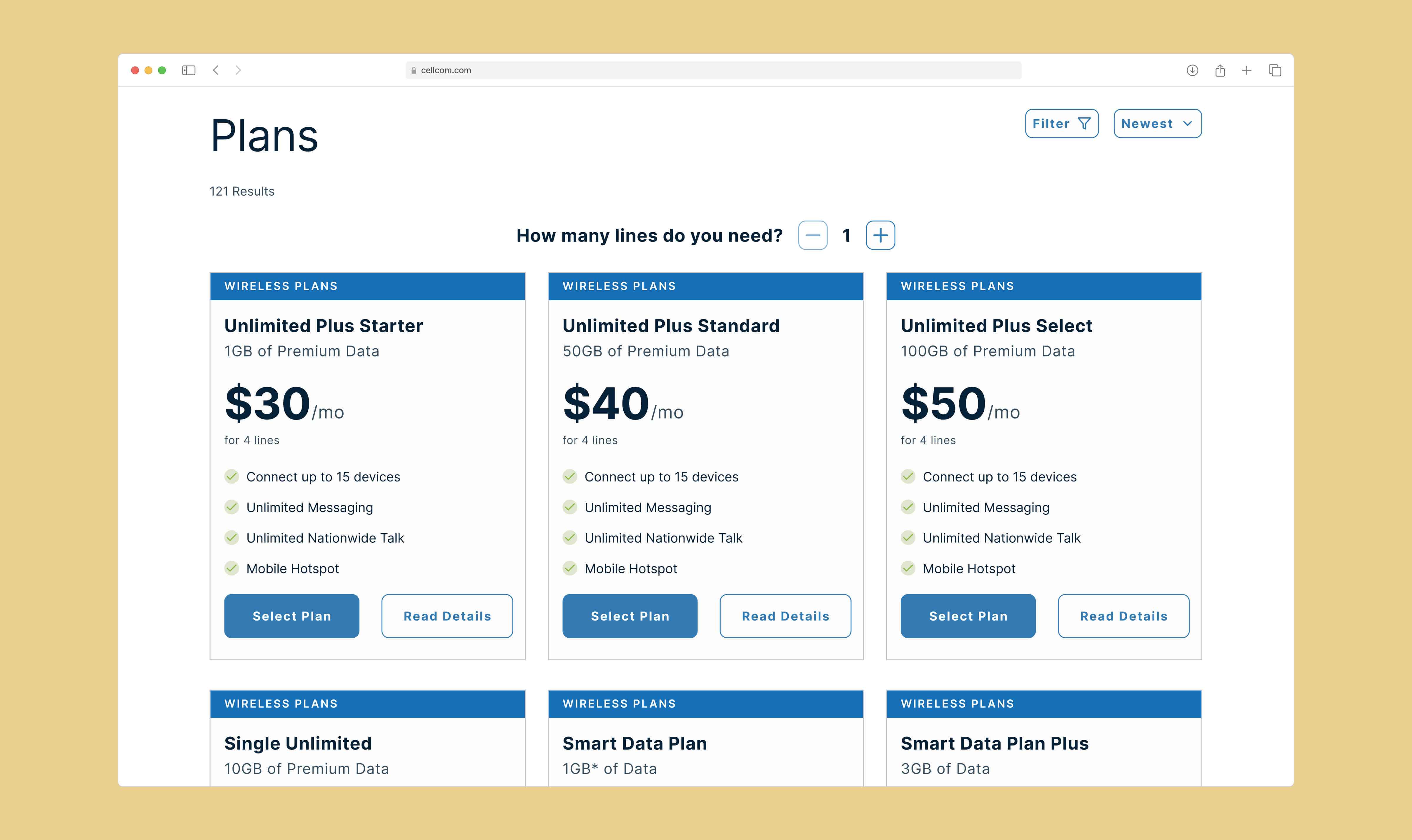
From there, we worked closely with Cellcom’s branding designer to integrate the updated visual language. We created development-ready designs for key shopping pages, product detail pages, and the entire checkout flow, ensuring the new structure was paired with a consistent and modern visual style. We also set the team up with a Figma design system. This included reusable components, typography styles, and color tokens so the brand could maintain visual consistency as it evolved.
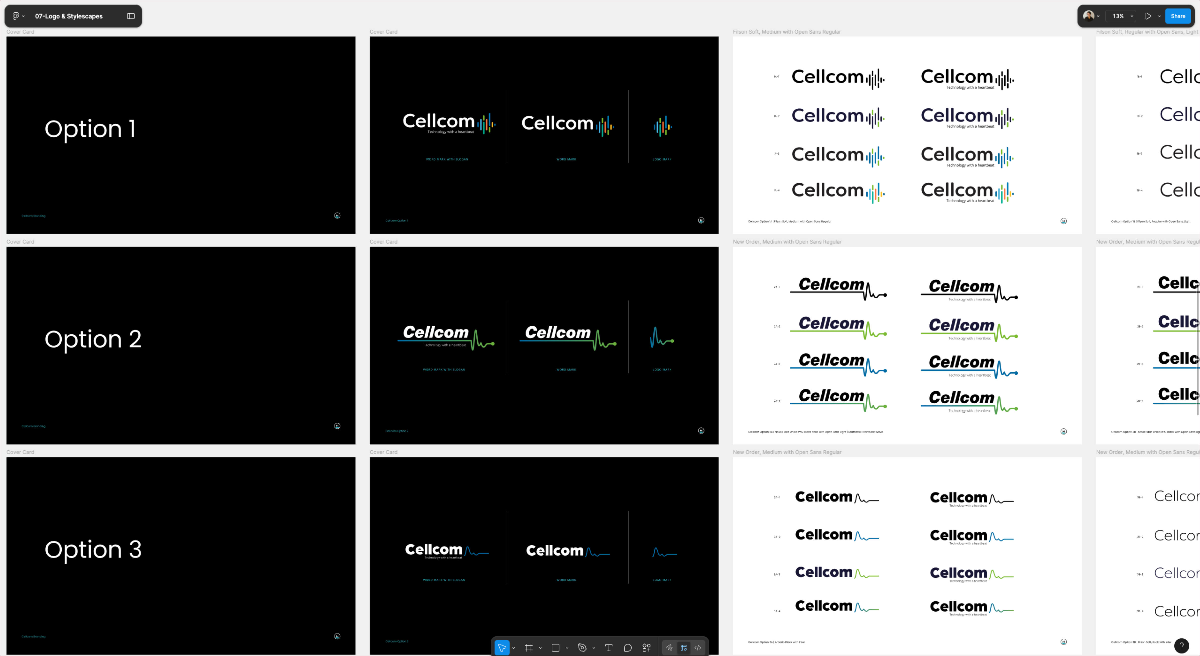
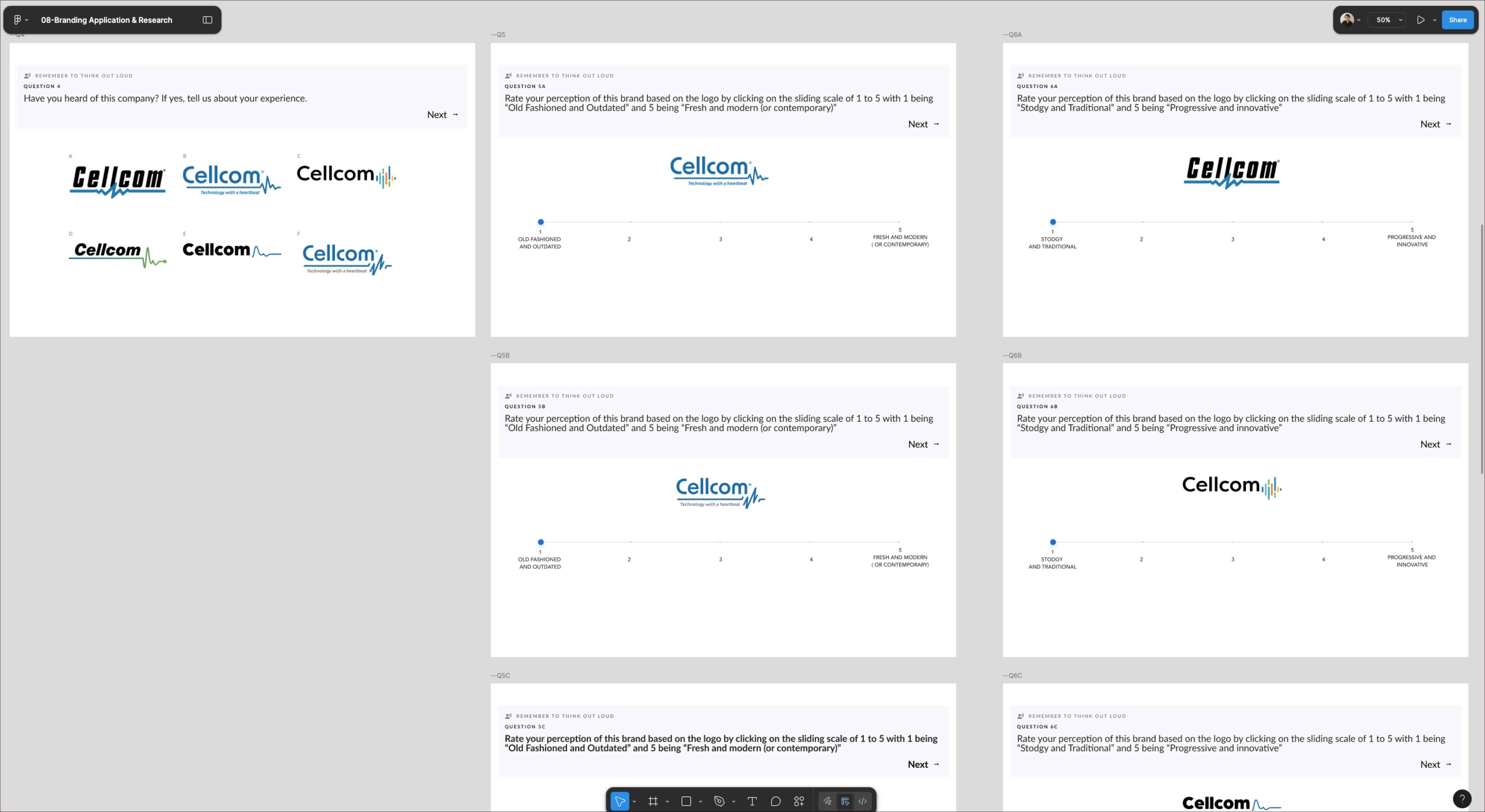
5. Research Study Two: Brand and Perception
As part of the brand refresh process, we conducted ten in-person interviews with participants from Cellcom’s target demographic of younger customers in Wisconsin. These interviews gave us insight into how the brand was perceived, what customers valued most in a wireless provider, and how visual identity influenced trust. These insights directly shaped the refreshed brand direction and the tone of the new ecommerce experience.
6. Final Solution
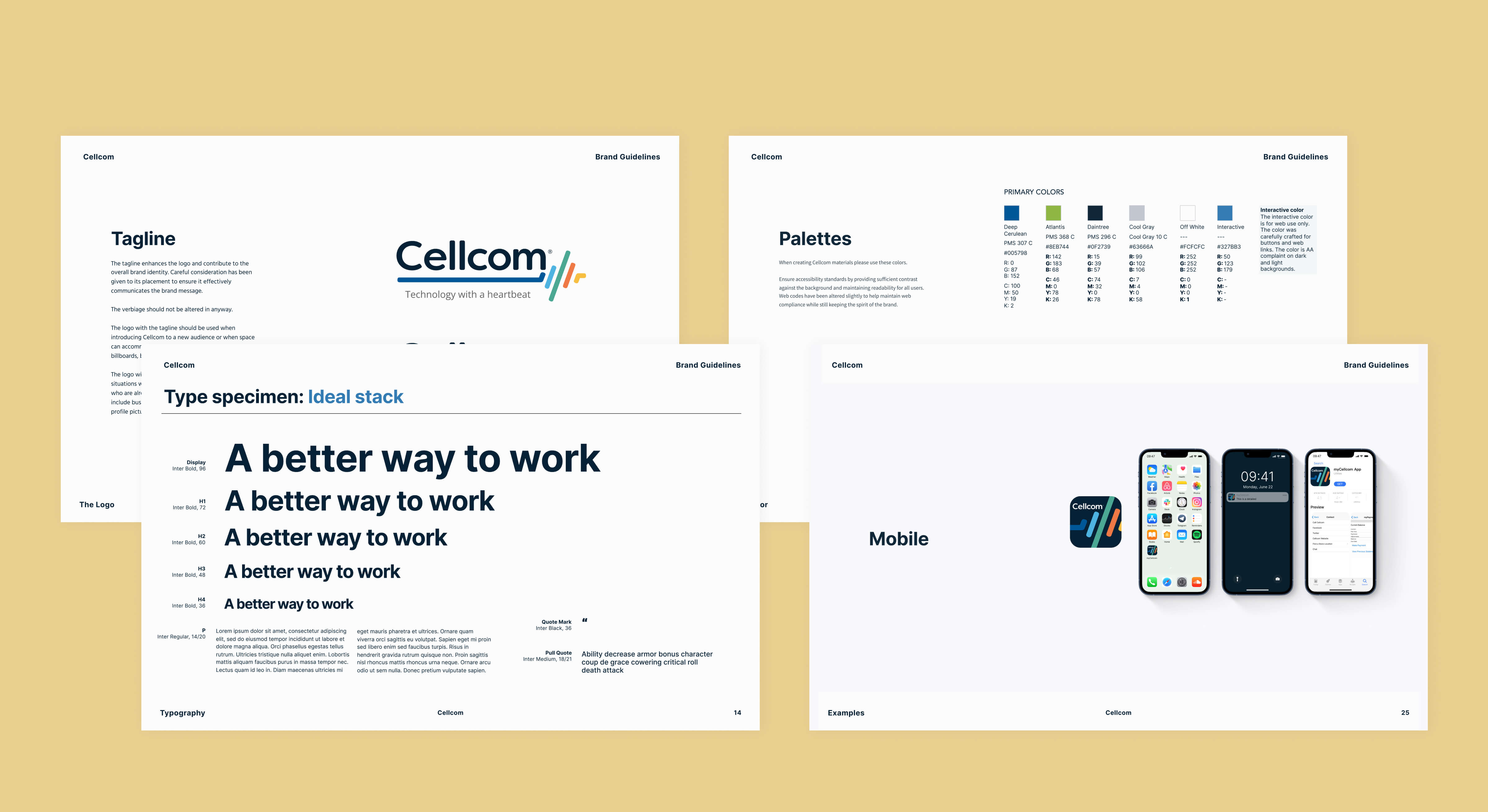
Cellcom received development-ready designs for their new ecommerce experience, a fully documented Figma design system, and a brand system that could scale. The refreshed site was clear, modern, and aligned with the expectations of their target audience. They also left with a brand book that gave them the tools to maintain visual and messaging consistency moving forward.

7. Reflection
This project showed the impact of combining deep UX research with a structured redesign process. By pairing improvements to the checkout flow with a refreshed brand and a scalable design system, we helped Cellcom deliver a more engaging and trustworthy experience for their customers.